
Here are some results of the breeze-icon mimetype redesign. As you can see we make use of your feedback.
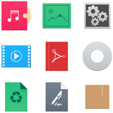
What is still missing? The archive, vector graphic images and virtualbox icons will get some love. After the shapes are finished Alex will work on the colors and gnastyle on the MS Office icons.
Be part of it
git clone:https://github.com/kde/breeze-icons

these look awesome. thank you for your effor1
Top right icon looks like a settings app, not a MIME type. Top left one looks like a new icon for Juk or some other music player.
Don’t make MIME type icons square-ish.
+1
I don’t share this impression. Especially the music file looks nice to me.
I only miss a seperator at the zipper to make it more clear. Maby it should be 10% open.
As I wrote zipper is still not finished.
> Especially the music file looks nice to me.
Is it a single music file or is it the icon of a playlist? The icon suggests it’s an album, so I guess playlist?
They look much better now 🙂 Thanks for your hard work.
look awesome! thanks. Is the top-right a mime for scripts? it looks like a program launch, delete the frame for example
Pingback: Links 18/9/2016: Emacs 25.1, Slackel 6.0.7 | Techrights
why dont you merge icon and icon dark themes as gvg color change mod is there
I like the icon, simple,clean, has character and weight professional.